Creative Publications / Editorial Design
Art Direction
From Nevada with Love — An immersive edition combining iconography and visual storytelling
Art Direction
& Design
Conceived as an editorial object in its own right, From Nevada with Love unveils a graphic exploration where every detail contributes to the project's identity.
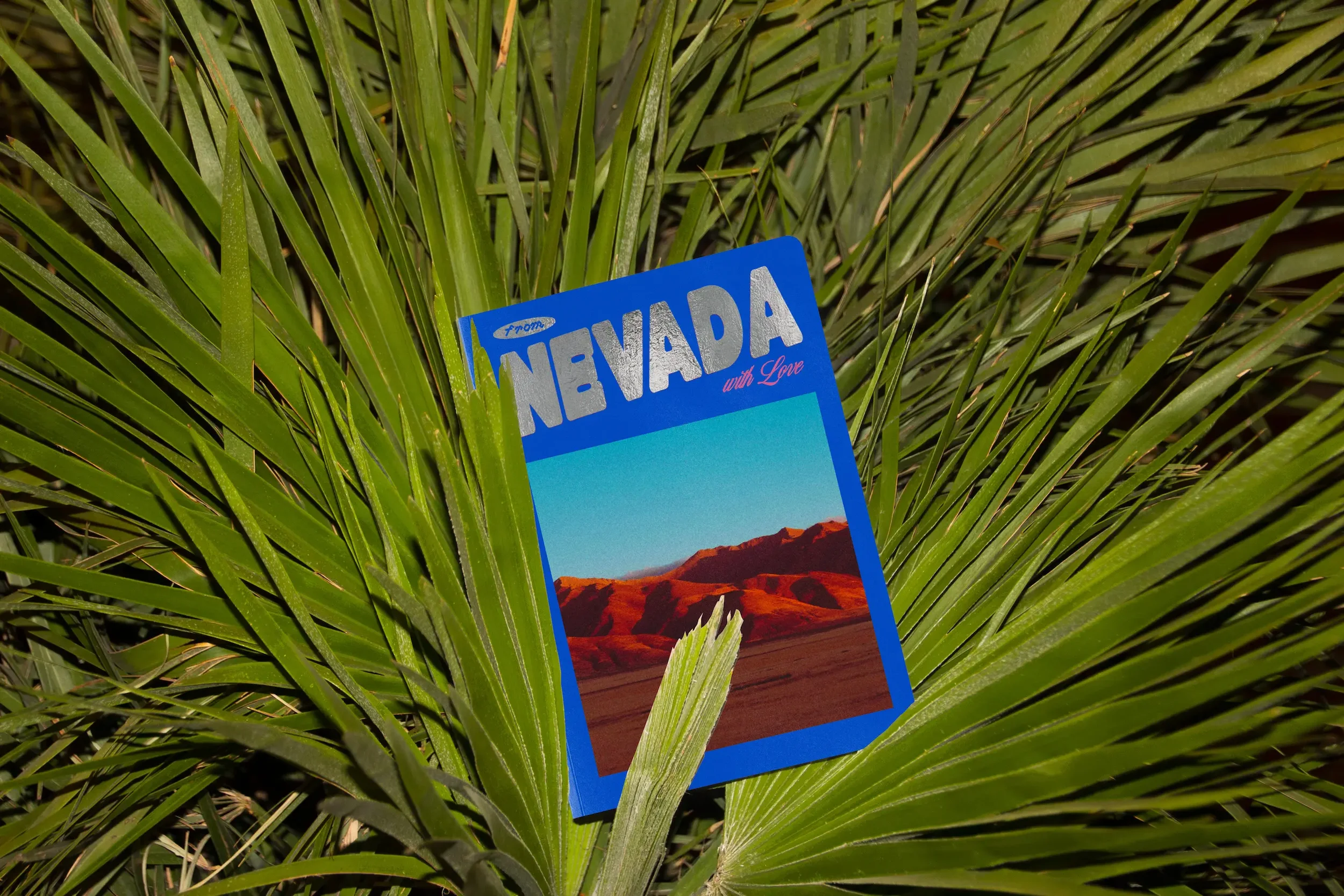
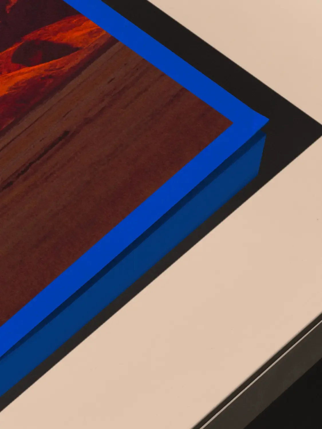
The art direction revolves around an intense blue, silver gilding, and elaborate edge design, establishing a strong, sensitive, and immersive atmosphere from the moment it is first held.
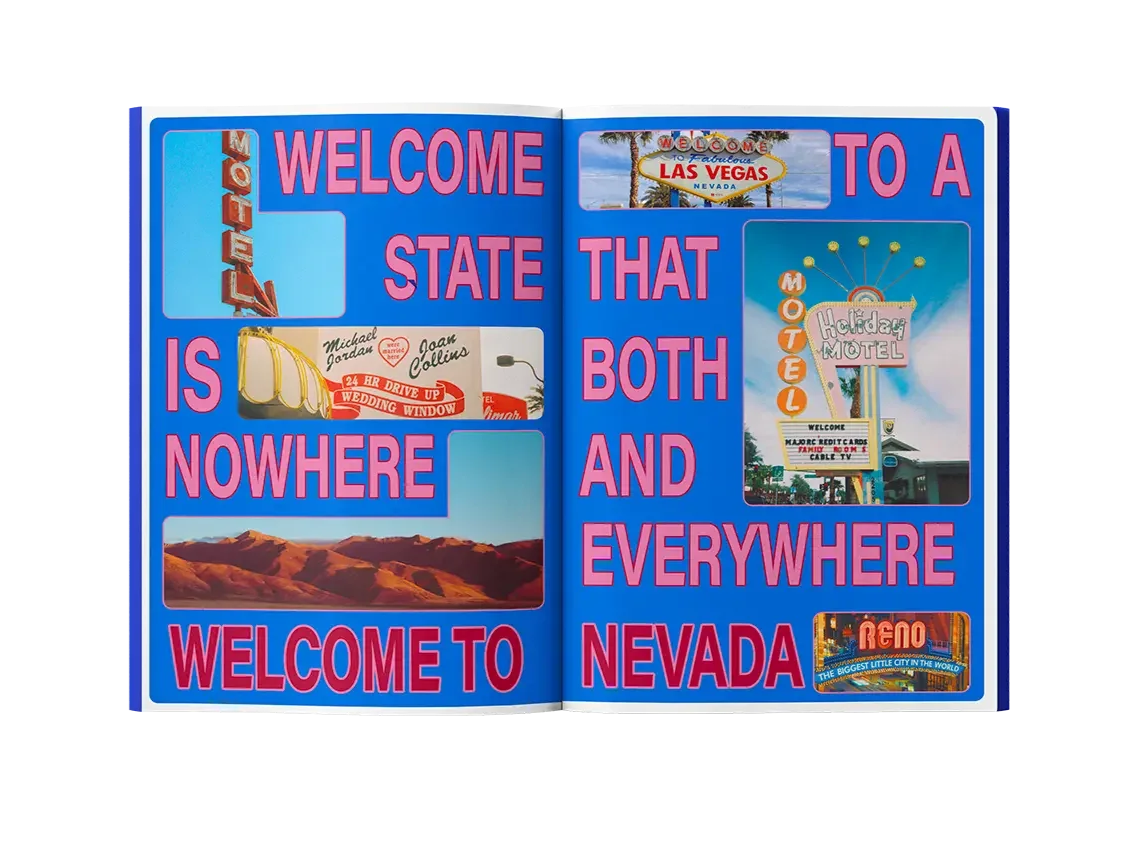
The publication draws upon the iconic imagery of Nevada (endless roads, motels, and contrasting light) to reinterpret them through a contemporary lens. Textures, materials, and plays of light combine to create an initial impression, designed as an invitation to discovery.
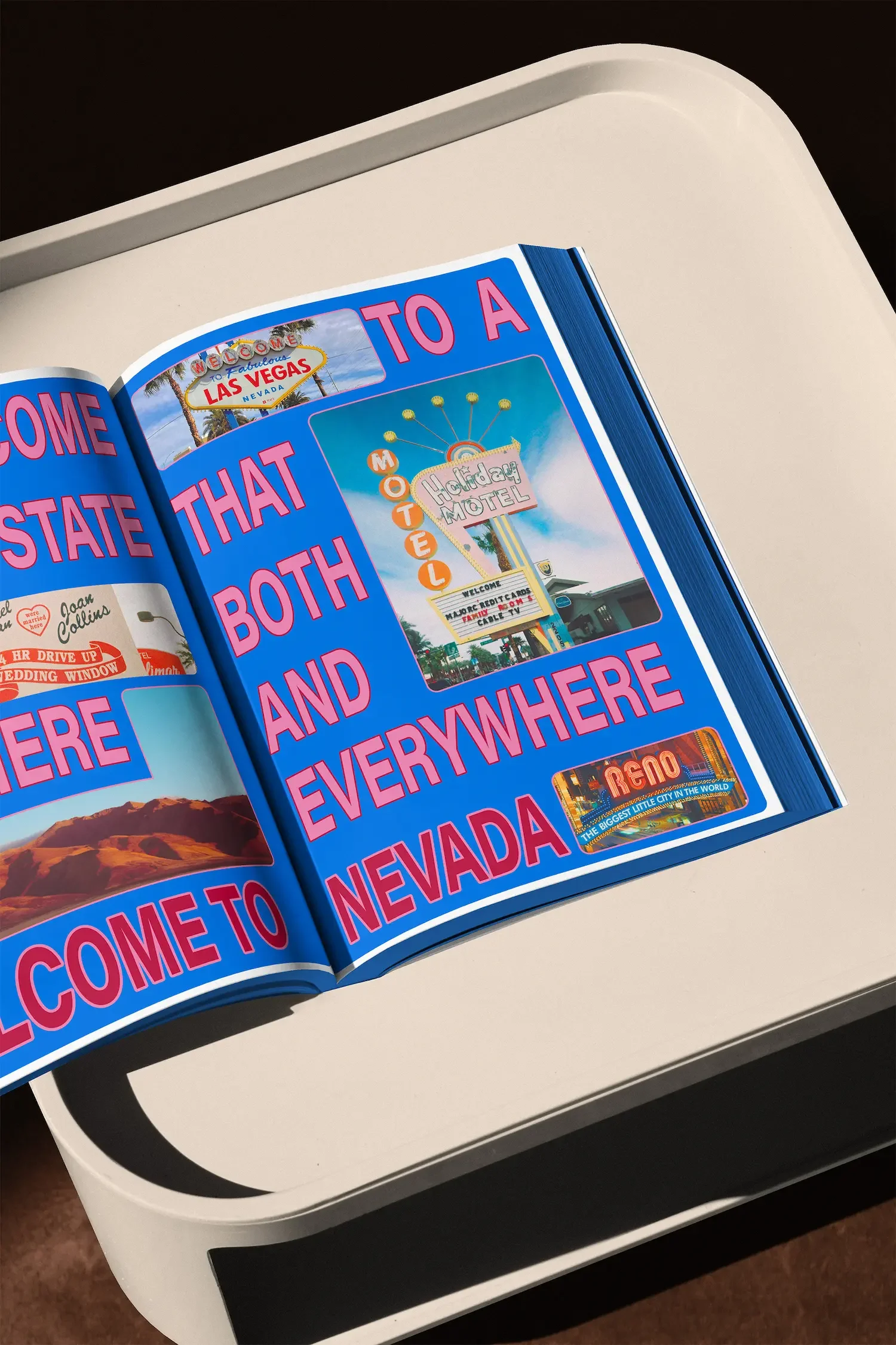
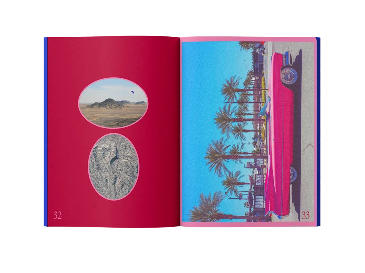
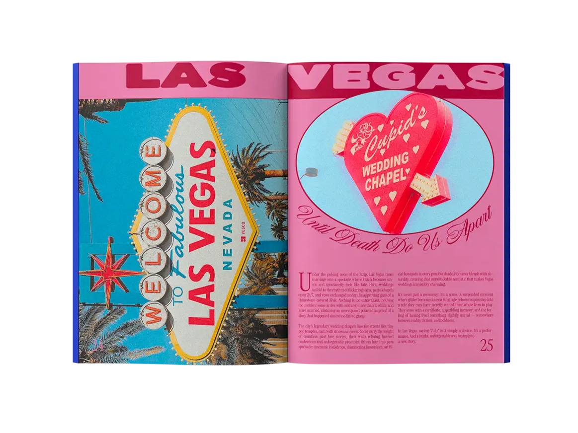
Inside, the visual language is amplified: vibrant colors, generous compositions, and layouts designed as true graphic scenes.
This is a distinctly maximalist approach where typography, images, and colored blocks interact to create rhythm, storytelling, and a gradual sense of immersion.
Every page contributes to a coherent, expressive, and deeply visual whole, faithful to the graphic signature of Ateliers Coco.
Result & impact
From Nevada with Love goes beyond a simple book format to become an immersive and sensory editorial piece.
The harmony between art direction, editorial design, and production choices transforms the publication into a complete experience, designed to be viewed, handled, and cherished.
The back cover expands on the project's theme with a color-enhanced image, inspired by the iconic motels of Nevada. Its striking contrasts and saturated colors make it a powerful element, contributing to its visual appeal, narrative depth, and overall identity.
Each aspect of the project acts like a piece of a graphic puzzle: it stands alone but is closely linked to the others.
This publication was designed to make a strong impression, define a unique brand world, and illustrate Ateliers Coco's expertise in art direction, editorial design, and creating printed materials.

A strong art direction, conceived as a global visual language, incorporating contrast, texture, and storytelling ↘︎
An iconic cover featuring deep blue, silver foil, and photographic and graphic references to Nevada ↘︎
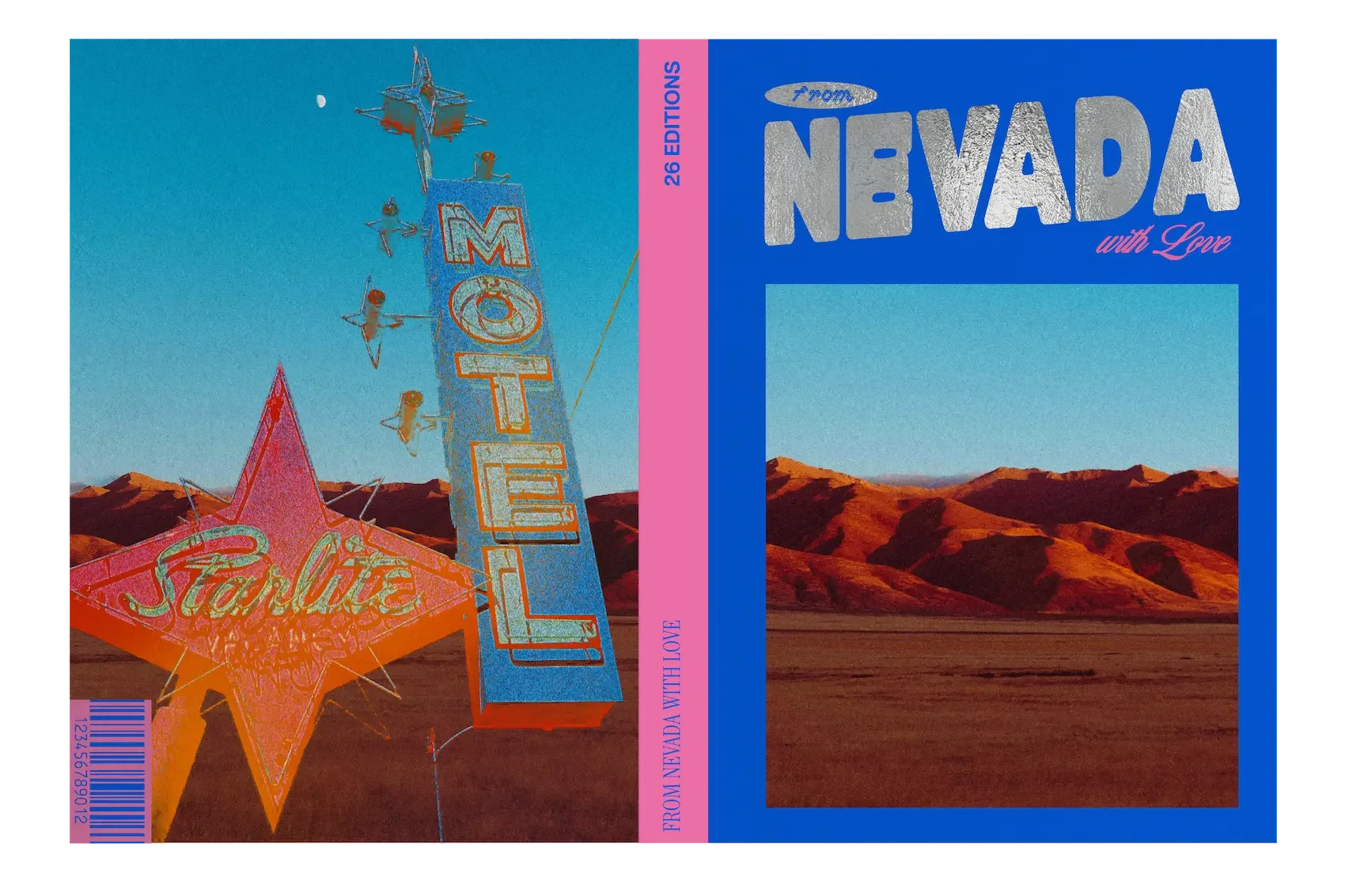
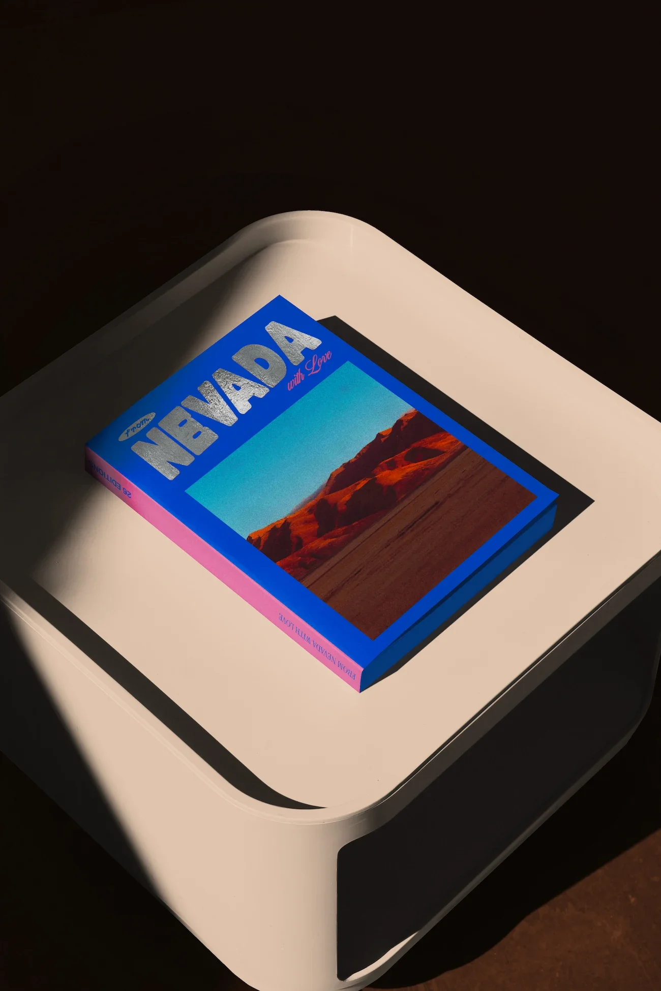
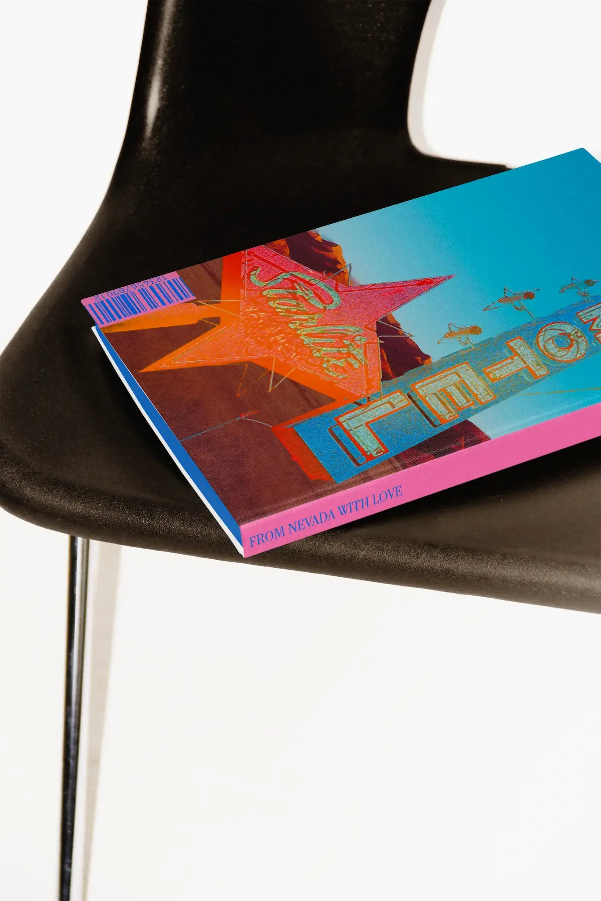
A royal blue edge coloring, crafted as a signature detail, reinforcing the editorial and collectible nature of the edition ↘︎

Generous and vibrant layouts, designed as truly immersive graphic scenes ↘︎
Looking to create a beautiful (and cool) publication for your project? This is the place to be!